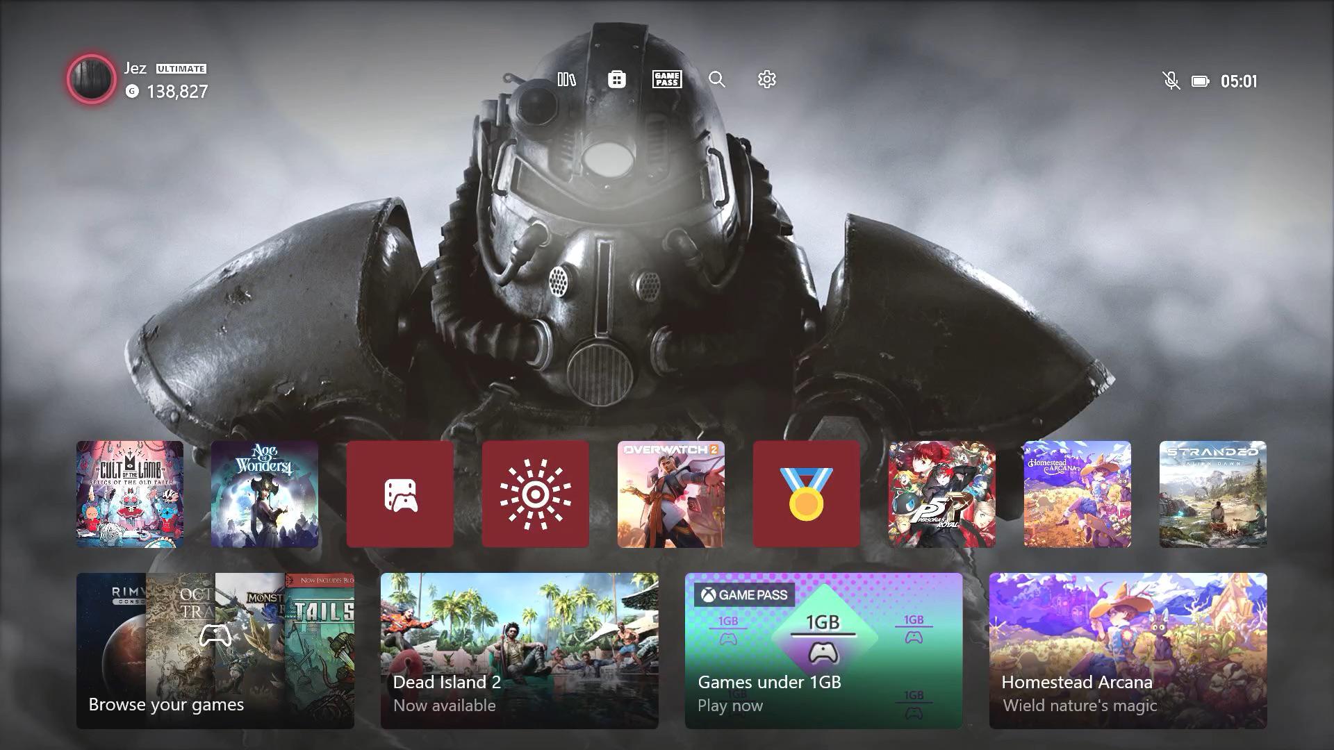
Im talking about the general design, not the layout!
I personally like the design. Is elegant and minimal without being TOO minimal, you know. I like the dynamic bacgrounds and love the fact that i can choose the colors.
I also like the "neon" lines around what is selected. The sounds are cool as well, but i do prefer the ones from the early Xbox One Dashboard.
Posted by sonicfonico

13 Comments
I still press down to go my games and suddenly open the store
Honestly I like the new style but the old ones are always OG! I feel like they can use an upgrade to the dashboard
It’s alright. No special attributes or anything that makes it stand out. It just works. And yeah, a lot of people want something that just works, but I miss those days when Xbox UIs had personality too; something that made them memorable to look back on and reminisce.
Underwhelming next gen UI. Not that different from the last gen. While I like the sale reminders it’d be nice to have the option to remove it.
Also, why can’t I make a slide show of my in game screenshots for my background? What’s prevented adding that very simple feature?
It’s lazy and uninspired.
The 360 was incredible with its dashboard updates making the console feel refreshed and new without any hardware changes.
From a UX and UI perspective, the XB1 lowered the bar which remains in place today.
I don’t spend a lot of time looking at the dashboard so it’s fine for me. Probably their best variation so far.
I think its fine. Does what it needs to do. Looks cool also with dynamic backgrounds
Current UI design for xbox, playstation and switch are all garbage.
Purely utilitarian. I personally like flash and flair.
Ps3, wii u and xbox 360 interfaces were actual perfection.
The fact they’ve been back-peddling on design for 2 generations is crazy.
Too flashy. It is more form over function.
Still don’t care lol
Too few icons, too much empty space for the wallpaper
It’s unbelievable to me how in 2024 we STILL don’t have the option for a black interface.
They literally already have a black interface integrated via high contrast mode, why tf can we not just get this as a theme so we can still use wallpapers, pick our own colour and don’t have a white outline for everything.
I couldn’t care less. As long as my games are accessible I’m happy. Don’t think I’ve spent more then a few seconds looking at it before launching a game.