
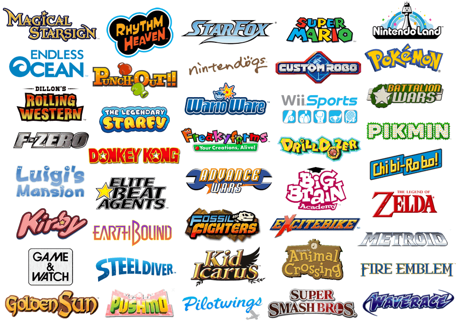
Which Nintendo games do you think have the prettiest and coolest logos or the ugliest and most boring ones?
Posted by ComprehensiveDate591
Which Nintendo games do you think have the prettiest and coolest logos or the ugliest and most boring ones?
Posted by ComprehensiveDate591
9 Comments
Even though it’s nothing special, I like the Rhythm Heaven logo, it fits the surreal yet playful vibe of the series. I also like how Animal Crossing’s is a ‘Welcome’ sign.
As for bland ones, I guess F-Zero. I understand that it’s an industrial racing series but I feel like they could’ve done a bit more to emphasize the “racing” part. Even then, it’s not bad or anything, just average.
Splatoon is the coolest in my opinion.
I don’t think any is straight bad or boring, they had their own charm.
Metroid deserves better than WordArt from office 2003 with a gradient
Metroid is my personal favorite. Simplistic is always better. It’s the perfect font for the word and for representing the series.
Plus The Legend of Zelda’s logo is just iconic.
The Game & Watch logo is so stylish
Don’t get me wrong, Iove the Pokémon logo, it’s iconic and has a special place in my heart filled with nostalgia. But I from a design viewpoint it could use an update.
Doesn’t Star Fox have a different logo for every game?
Xenoblade’s logo is so incredibly well done. Each game’s variation is tied to the themes and other important things in it’s respective game.
XC1 had a brush stroke like font, similar to the Monado Arts’ icons. XC2 was on fire, referencing Pyra’s element. And the 2 had her X on it. XC3 then had the words dissipating into light motes like when people die and the 3 had the term marker. Plus Future Redeemed’s logo fused not only the main XC3 logo, but also the brush strokes and fire from 1 and 2’s logo.
I’ll step away from the typical four logos. The Donkey Kong logo is so underrated given the greatness of it’s games and I think that The Starfy logo sticks out too much for a game franchise is even less relevant than Kid Icarus.