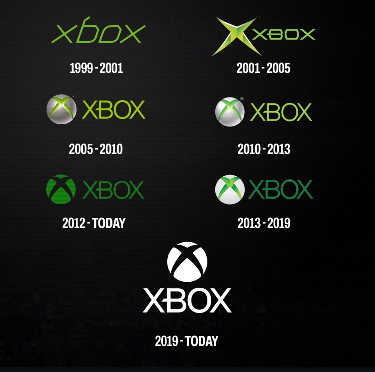
Share Facebook Twitter LinkedIn Pinterest Bluesky Threads I like them all (except the first one), but my favorite is definitely the 2013-2019 one Posted by Cafa20
USMCArmyRanger on March 1, 2026 2:50 pm 2013, love the contrast of the white and green, and the shadows look cool on the “X” logo.
DrKrFfXx on March 1, 2026 2:51 pm The 2nd, 3rd and 4th are basically tied to the era. It’s like someone said “make a an early 2000 logo” and that’s what comes out. Same for mid 2000s and early 2010s.
SpectersOfThePast on March 1, 2026 2:51 pm I wish they would do a more modernized version of the 2001-2005 logo for their next thing. Just bring it back to the beginning.

14 Comments
The og xbox 360 one is my favorite
2012
2010-2013
The green one
Last one, simple and clean
01-05
2010-2013 but I’ll take the one before it
2013, love the contrast of the white and green, and the shadows look cool on the “X” logo.
2001-2005☝️👀
The today one is my favorite.
The 2nd, 3rd and 4th are basically tied to the era.
It’s like someone said “make a an early 2000 logo” and that’s what comes out. Same for mid 2000s and early 2010s.
Xbox
1) xbox 360 era
2) modern one
I wish they would do a more modernized version of the 2001-2005 logo for their next thing. Just bring it back to the beginning.