coolambiguity on April 19, 2026 7:20 am I like it, its a small change but a welcome one. However I would like to see a unification of the ui across all xbox platforms. I want the console, pc and cloud interface to be exactly the same. Not the biggest fan of the PC interface but the console and cloud looks good.
UltraScum on April 19, 2026 7:33 am Am I the only one that just wants black, easy to read, simple, minimal, and efficient? Do people actually sit and stare at their Home Screen like???
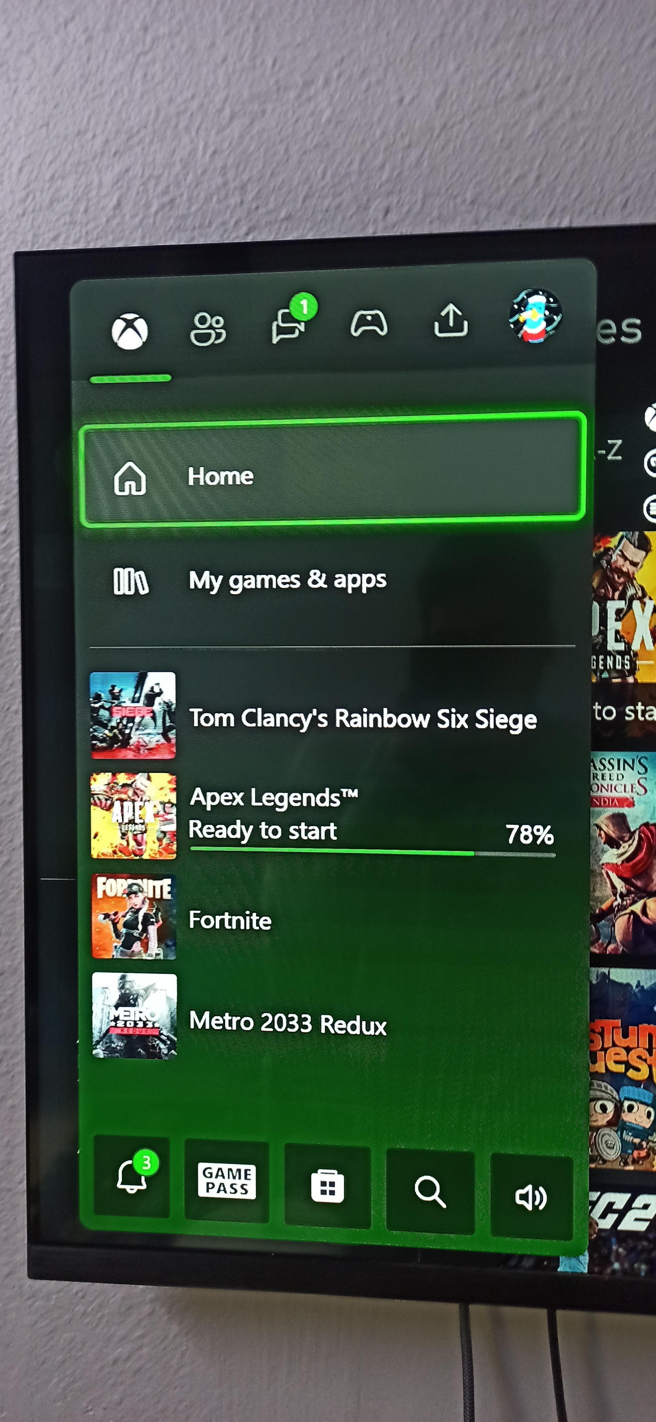
multienter on April 19, 2026 7:35 am Where’s that Win11 look that had 9 titles on the Guide in a 3×3 grid and “glass-like”? Would anyone want that? I personally do not need everything in the Guide to be labeled if these labels are taking usable space away.
Remote_Drummer6011 on April 19, 2026 7:43 am Best thing is you can now choose a more precise color now. I wanted dark purple for a long time, looks sick
Charming-Objective14 on April 19, 2026 7:46 am Some people are easily pleased, still full of shitty adverts even though they keep increasing the price of the console.

10 Comments
Looks the same…
I like it, its a small change but a welcome one. However I would like to see a unification of the ui across all xbox platforms.
I want the console, pc and cloud interface to be exactly the same. Not the biggest fan of the PC interface but the console and cloud looks good.
I like it too
Am I the only one that just wants black, easy to read, simple, minimal, and efficient?
Do people actually sit and stare at their Home Screen like???
Where’s that Win11 look that had 9 titles on the Guide in a 3×3 grid and “glass-like”?
Would anyone want that? I personally do not need everything in the Guide to be labeled if these labels are taking usable space away.
Best thing is you can now choose a more precise color now. I wanted dark purple for a long time, looks sick
Some people are easily pleased, still full of shitty adverts even though they keep increasing the price of the console.
A slight green fade is a huge W to you?
Really? I cannot tell the difference…
Do Xbox one users get it?