
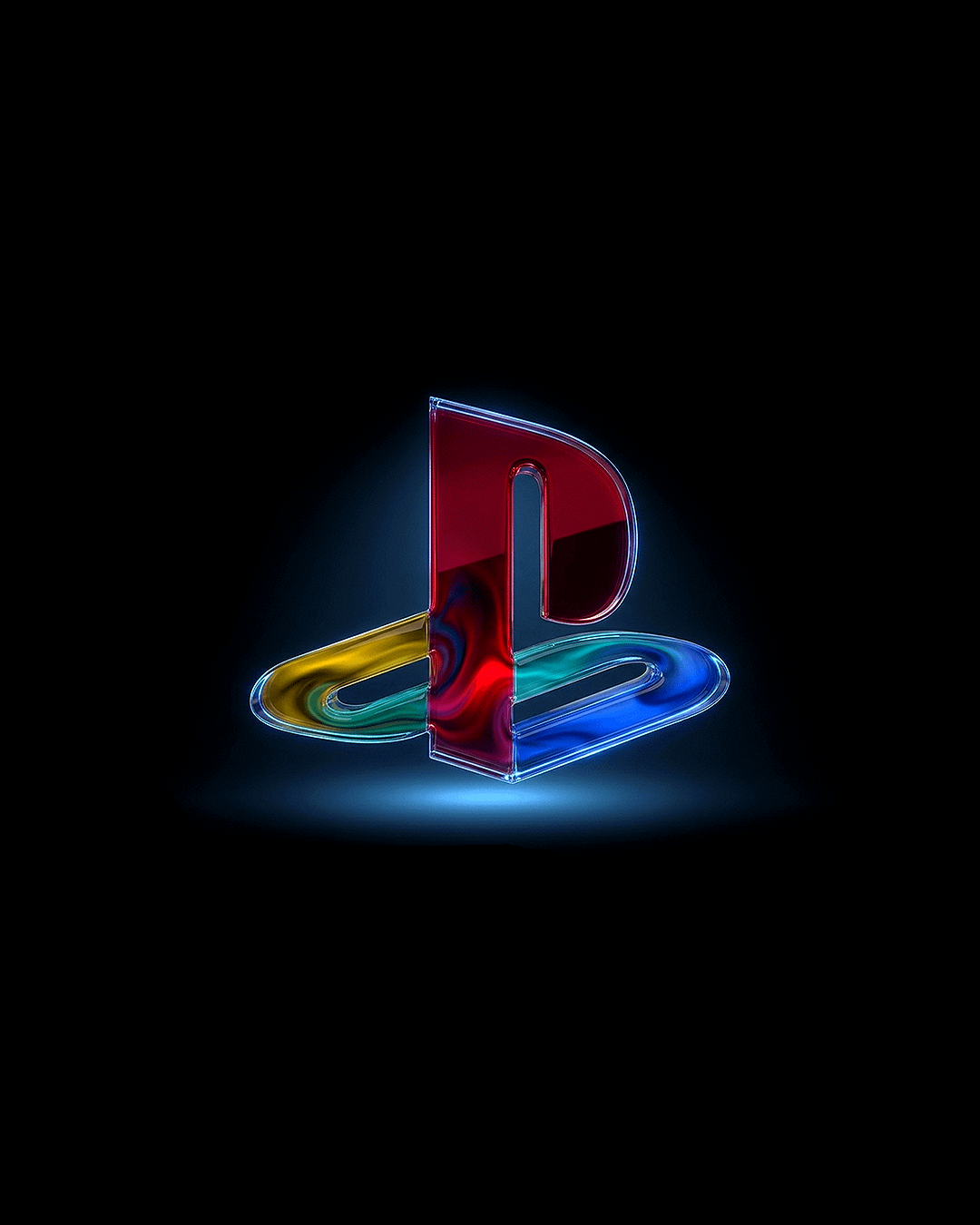
I’m love gaming across all platforms, so the new Xbox logo really excited me! Here’s a PS one I made in Blender and Photoshop
Posted by xyz_x
I’m love gaming across all platforms, so the new Xbox logo really excited me! Here’s a PS one I made in Blender and Photoshop
Posted by xyz_x
41 Comments
Post in r/frutigeraero they’re going to love it.
Nice work
Looks awesome 🔥
Either this is a strange coincidence or some AI bot account is trying to steal your thunder:
https://www.reddit.com/r/playstation/s/Z5tnCTtHXr
That is beautiful!!
I wish they would return to this logo. Alone the controllers would look so much better with it.
I like it, but I’d tone down the reflective properties a little bit and I think it be 10/10. Just looks a little off in the yellow,teal, blue section.
I think ps with stick with the whit logo … but i think i prefer the old logo
I love this. It’s crazy how new logos cost big companies millions, and you’re just a dude who did this in their spare time
Dope. But not digging the white shaded background
I hate Liquid Glass but this looks really nice.
Am I the only one that hates this glass trend
There’s a new Xbox logo ?
Idk, I want to bite it for some reason
Looks delicious with these colors 🤤
My new background. Thank you!
Looks very next gen, I love it!
Would look a lot better if it was all consistent. The swirl designs stop halfway up the red section. Personally the flatness of the top of the red part looks much better than the rest of it.
Pretty sure this is Ai lol
Very nice actually
Damn. That’s awesome.
That’s awesome
Dope design g
Love it. Reminds me of stained glass
Nice!😎👍
So fucking cool! This should be used for ps6! Congratulations!
I’m surprised how divided the opinions are. I think it’s a lovely piece of fan art.
Dope
New Wallpaper
knowing modern companies, they’ll find a way to mess up the logo and baby simplify or futurify it
Will use it as my psn avatar!
Looks like you used logo shader.
I feel like it would make ripples if I touched it. 10/10
This is simply beautiful, excellent work.
Good job, you should send this to Sony for fr
the original playstation branding just had so much character that the modern stuff can’t touch, even with all the fancy rendering tech now it feels sterile compared to this.
This is sick.
Old school PS1 and N64 logos were peak.
It looks like those cheap lollipops you’d get at the grocery as a change, I want to lick it! Really cool job, I hope Sony buys from you.
For some reason I want to eat it, reminds me of some gummy fruit roll up something
Neon design looks fierce but yeah, that classic colored button layout hit different back in the day. Modern minimalism wins corporate points but loses the personality.
They should bring back this for ps6 and also cycle through all the previous startup sounds when turning the console on.
neon work is clean. the color gradients on the controller buttons look sick.