
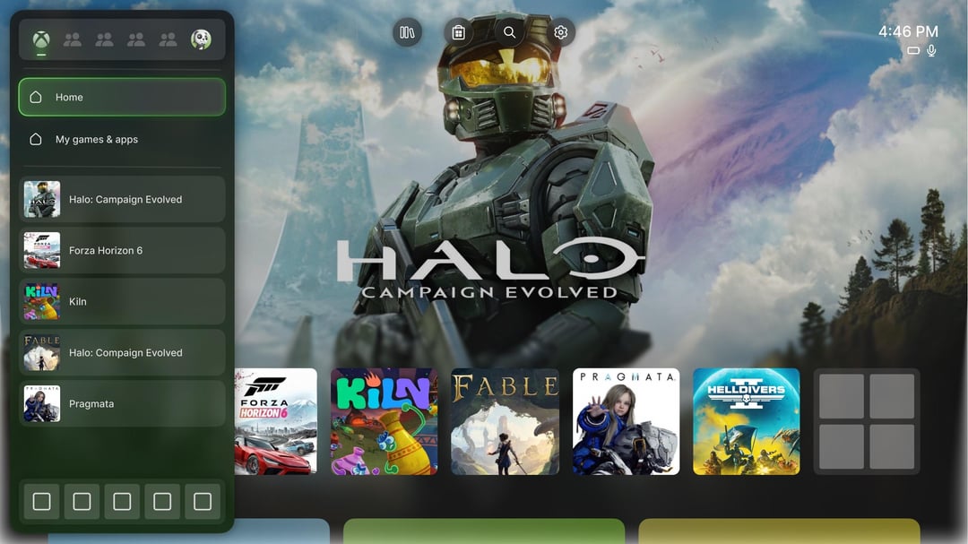
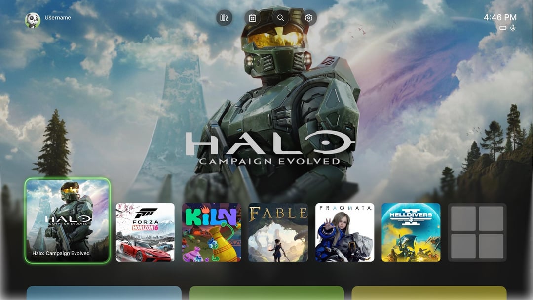
Since you all liked my last post so much I decided to finish the concept that was based on the new Xbox logo. There may still be some placeholders and bad game icons because I couldn’t find good images but the concept is now complete. Thank you
Posted by Few-Employ9640
16 Comments
Definitely needs more 3rd party ads! That would really tie it all together!
I actually still prefer like a blade dashboard design. Would be nice if they can make like a mix of OG Xbox with 360
I could see this being true. It looks cool. I wish every game banner was a dynamic one though.
Not a fan of rounded boarders but that’s the trend now.
Not too bad!
Looks pretty much how it looks on Alpha Skip Ahead.
Imagine they give us the Xbox 360 blades dashboard.
An improvement for sure but I think it’s too similar to what we have now. I hope they completely refresh it with something new that’s black and neon green, harkening back to the original color scheme. I’d also like a fully customizable home screen, move any tile anywhere, similar to a Windows desktop, or a smartphone.
Want them to go side to side, community tab got buried and I wanted to keep seeing friends clips. More like Xbox one. Just don’t give me clips of people I don’t know or “influencer” clips
I know everyone else doesn’t like them, but I kinda like my ads. Sometimes I don’t remember when Game’s coming out and it happens to be right there.
The only ones I dislike are the Burger King and Arby’s/McDonald’s advertisements. I don’t eat fast food
But outside of that, it’s really neat extremely simple. I don’t necessarily know how I feel about simple it’s not bad. It’s just the blades in the tiles were pretty intricate and incorporated. Multiple aspects of what your Xbox can do.
It basically the same thing without ads.
Halo: Compaign Evolved
clean, transparent and actually lets me see the background art. this is exactly what the xbox ui needs to be. microsoft should hire you because the current dashboard feels so cluttered compared to this
Pragmata XD
Are you going to repost this every other day now?
Looks great but aren’t you missing a full screen pop to try and force me to use copilot?