
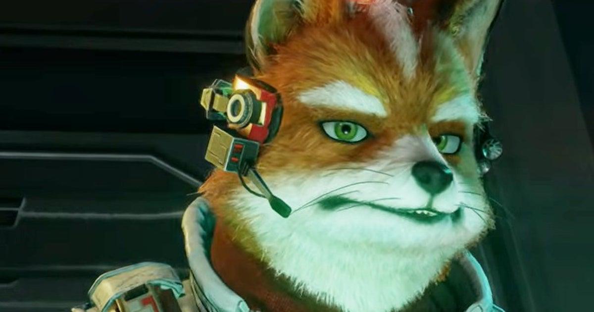
Star Fox’s original artist reckons Fox McCloud’s design is better in The Super Mario Galaxy movie than it is in the Switch 2 game
Posted by Turbostrider27
Star Fox’s original artist reckons Fox McCloud’s design is better in The Super Mario Galaxy movie than it is in the Switch 2 game
Posted by Turbostrider27
38 Comments
and he’s right
I think his jaw needs to be more defined. The white crest makes it look like he has a fat chin lol
This Japanese developer said “I reckon”
I strongly disagree. Very generic looking in the Mario movie. Much prefer this slightly weird realistic look.
I just completely disagree. They slopified his design in the mario galaxy movie. The switch 2 design looks a little closer to Fantastic Mr Fox which is always what I’ve wanted the series to get closer to
Shouldn’t something always look better in a pre-rendered movie vs real time rendering?
Imo the lighting/rendering in the trailer was kinda weird whereas the static image renders of them all look fine.
A load of bollocks on this one.
>The first franchise in history to gain four remakes of the same story.
Buddy have you *ever* seen Superman?
The new design is great. Look at all the official renders Nintendo has released of the crew. They look phenomenal. I just think the in game model and some of the lighting isn’t doing the new design for Fox justice.
I think they’re both great, but I’m not against movie Fox looking different to game Fox. There’s not too many series in Nintendo that can pull off more realistic or gritty visuals, but Starfox is one of them, and I think it works quite well.
I hate it too, idc how much like the puppets they tried. Fox and Falco look horrible. Stages and music are amazing, but the team looks bad to me.
I honestly like the new designs a lot, but then I loved Fantastic Mr Fox also. It kind of fits for an odd hybrid of the cute goofy woodland animals in space concept mixed with actually surprisingly brutal hi-tech space-war. It’s a little off-kilter, and I like it for that. They’re quite expressive too.
Surprised they didn’t go with that direction
Well yeah. The stylized look from the movie is better and more “video-gamey.” He’s almost too realistic (and chonky) in the new game.
I like both designs, admittedly SMG more than the game, but I imagine there’s a rights issue with using that design as it was created by Illumination?
He went from Glen Powell to Nick Offerman
Personally I would’ve preferred something a bit closer to the models they had for Zero on the box, but I can get behind the semi-realistic.
The new designs look outstanding.
I feel like the article doesn’t give enough context either. Is he talking about the design as a whole, like he looks better cartoon-ized vs more realistic? Is he talking about just the head shape? He looks a little less ‘lean’ from some angles because of the more realistic fox anatomy, but the new design is superior in almost every other way.
Also in what ways did he design the original? Did he just sketch them/come up with the concept? Or was he the artist/creator of the original puppets themselves (or both)? In the original game they look much more cartoon-like with those 32-bit pixels than in the promos/box art as well. Did he design those? Maybe in creating the puppets the artist would’ve wanted to make them more cartoon-like, but didn’t have the means to do so at the time.
That said, ultimately what was made became iconic to the original game regardless of how he would’ve preferred them to look… So it’s kind of something that exists independently of the artist now.
It’s an unflattering still, other angles work better but he didn’t appear that expressive to me in the release video, which is my concern. Slippy is expressive but the other 3 seem stiff to me.
He has no neck in the Switch 2 game
Is it controversial to like them both?
Honestly I really like Fox’s new look, except maybe the boots. Falco on the other hand… Why did they do him like that?
I like the new designs. Only part I’m sad about is Fox and Falco losing the cool space boots
Solid agree. And A Fox in Space has kinda spoiled me on sharp storytelling and a darker tone in the Starfox universe.
He “reckons”?
Is he from the south?
I’m more upset at how terrible Slippy’s voice is.
the style of the animation has to fit the voice actors and the action and script written for it. I do believe the Movie version is a little more whimsical and goofy and quick witted. This game version seems more grounded, slower dialogue, serious, and honed in.
I don’t think the game will give the same energy as The Super Mario Galaxy Movie, so it shouldn’t look the same either. I think they did a great job.
I wish they went with a more 2D stylized look, like the [Star Fox Zero – The Battle Begins](https://www.youtube.com/watch?v=wA2-0nTxaGg) short or the 2D part of Mario Galaxy. But I prefer the realistic look than the Illumination design.
Fox McChongus
Maybe it’s just me, but I’ve noticed a lot of people saying he looks more realistic, and I kinda have to disagree. Something about him makes him look really uncanny compared to an actual fox. I’m not really sure what; maybe how wiry his fur looks?
“The most important thing for me is **D R A M A.**”
– Happy Chaos
I’ve come to like the new designs quite a bit, but it will take me a long time, if I ever do get used to it, the legs, I just wish they had boots and honestly I think they would have been perfect
Fox and Falco got royally messed up with this re-design. Absolutely hate when companies go for realism when trying to appeal to general audiences.
Star Fox Zero had the best design that both had a mix of realism tied with cartoonish proportions
What they did to Falco especially is a tragedy. He’s so frail looking, I just hate it, especially on the character that is supposed to be the “cool” one. Look at him in any of the Smash games, that’s a cool character.
The small crest on top of his head, the smaller beak, and the actual bird legs just look horrible.
He looks a little hunchback in this new style
I love the new design. The design in the movie was way too generic and looked like straight out of Zootopia or something. This new one looks more like Fantastic Mr Fox. The only new design I don’t like is Slilpy.
It’s okay to be wrong.
Design looks better overall honestly and the ones I see complaining about the designs are either furries or terminally online losers
I like this new look , it’s exciting and new. They can’t do this with Mario or Zelda!