Logos and rebrandings are cool and all but wake me up when new 1st party games are not trash and my console is not easily replaceable with a phone via streaming or the competition
madlego1996 on
Cool af
PerformativeRacist on
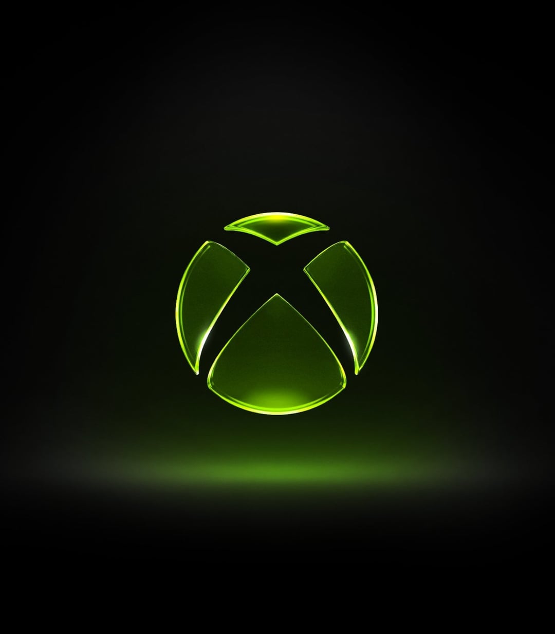
I like it, it’s like Jolly Rancher Green
Small-Olive-7960 on
Loving this xbox revival
DrWhiskerson on
I love it. Reminds me of my original Xbox
CellularWaffle on
Nice
mischief_scallywag on
May be jumping with joy early, but damn am I happy to see the positive changes at this rate
mooned42 on
The new CEO is actually doing things to make Xbox better as a brand, how about that? I actually feel like they have the interest of players in mind instead of shareholders. Big W
letsl0velain on
i love seeing a move away from flat minimalism but i’ll need to see it used consistently
Caffeinated_Narwhal_ on
When does this hit our loading screen?
okanagan_man84 on
Its not just the logo. Shes also dropped the price of game pass. Which to some I get that its not a alot. But the difference is thay of someone being able to subscribe and not.
newtnewtriot on
I swear, if they released the next Xbox or even a Series X in translucent green, I’m buying it.
NotYetUtopian on
Some nostalgia and 7 bucks a month and yall are ceo simping… sad state of affairs.
Nerd_199 on
Phil Spencer was the problem
Commercial-Gap6280 on
Genuinely, it feels like it takes the smoothness of the 360 era logo, the sharpness of the XB1/Series era logo, and immerses the combo in the radiation green glow of the OG era. I’m in.
agk927 on
Its green again? THANK YOU
bootysweat449 on
This and the game pass price are two things we don’t see anymore. I’m not one to glaze corps but it’s refreshing to see one go against the grain that is seen across all markets
Binx_007 on
Companies ditching minimalism is always good. I like the new logo
Follows-Jesus on
Ohh took me right back to the first time i booted up the OG, fantastic choice
If they improve on everything, I’ll give them another chance.
BatmanBeyondz on
Dope
lartmydude on
Common Asha W
JackCrom1 on
Xbox is green. It shocks me they ever distanced themselves from it.
DlNOSAURUS_REX on
Anyone ever notice how the logo is an X circle?
lncrypt3d on
All they gotta do now is push back into consoles and physical games
xKINGxRCCx on
I love it actually
DynaMach on
I assume the old logo will still be used in some format since this one doesn’t scale down well from a legibility standpoint. For instance I don’t see this showing up on the spine of a game or used as a small flavicon on a website. It does look nice and I hope it comes out this was a physical model they photographed rather than a render.
-DeathTapper on
Me likes.
BigAndTallRPGFan on
Trying to temper my expectations….but sort of getting excited. They may not come back to glory but they seem like they are at least going to go down swinging.
deeku4972 on
When in doubt, make your logo the same concept as MS office and watch the public support flow in
TheBuckinator on
Love the direction so far. In hindsight, Phil was phoning it in at the end. Asha is off to a great start, but she’s plucking low hanging fruit that Phil was letting rot on the vine.
She seems to be listening to the fans and players which is incredible for a change.
CM__Junk on
The minimalist logo is so so bad. This is beautiful. Classic redone in a contemporary style.

42 Comments
Very classic Xbox. I dig it.
Logos and rebrandings are cool and all but wake me up when new 1st party games are not trash and my console is not easily replaceable with a phone via streaming or the competition
Cool af
I like it, it’s like Jolly Rancher Green
Loving this xbox revival
I love it. Reminds me of my original Xbox
Nice
May be jumping with joy early, but damn am I happy to see the positive changes at this rate
The new CEO is actually doing things to make Xbox better as a brand, how about that? I actually feel like they have the interest of players in mind instead of shareholders. Big W
i love seeing a move away from flat minimalism but i’ll need to see it used consistently
When does this hit our loading screen?
Its not just the logo. Shes also dropped the price of game pass. Which to some I get that its not a alot. But the difference is thay of someone being able to subscribe and not.
I swear, if they released the next Xbox or even a Series X in translucent green, I’m buying it.
Some nostalgia and 7 bucks a month and yall are ceo simping… sad state of affairs.
Phil Spencer was the problem
Genuinely, it feels like it takes the smoothness of the 360 era logo, the sharpness of the XB1/Series era logo, and immerses the combo in the radiation green glow of the OG era. I’m in.
Its green again? THANK YOU
This and the game pass price are two things we don’t see anymore. I’m not one to glaze corps but it’s refreshing to see one go against the grain that is seen across all markets
Companies ditching minimalism is always good. I like the new logo
Ohh took me right back to the first time i booted up the OG, fantastic choice
https://preview.redd.it/ht2laen2y1xg1.png?width=317&format=png&auto=webp&s=cbbd1b3deeb8ad7de92db5c87b227345916543e2
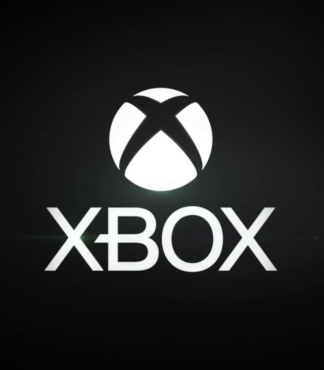
Gotta love a round logo for a product called Xbox.
It’s glass. Like all the Office logos!
https://preview.redd.it/o8xkd2z5y1xg1.png?width=800&format=png&auto=webp&s=5e0b06384875e1377823649bcfe1ec7e1585dd73
Fuck it start the Asha glaze
If they improve on everything, I’ll give them another chance.
Dope
Common Asha W
Xbox is green. It shocks me they ever distanced themselves from it.
Anyone ever notice how the logo is an X circle?
All they gotta do now is push back into consoles and physical games
I love it actually
I assume the old logo will still be used in some format since this one doesn’t scale down well from a legibility standpoint. For instance I don’t see this showing up on the spine of a game or used as a small flavicon on a website. It does look nice and I hope it comes out this was a physical model they photographed rather than a render.
Me likes.
Trying to temper my expectations….but sort of getting excited. They may not come back to glory but they seem like they are at least going to go down swinging.
When in doubt, make your logo the same concept as MS office and watch the public support flow in
Love the direction so far. In hindsight, Phil was phoning it in at the end. Asha is off to a great start, but she’s plucking low hanging fruit that Phil was letting rot on the vine.
She seems to be listening to the fans and players which is incredible for a change.
The minimalist logo is so so bad. This is beautiful. Classic redone in a contemporary style.
Love it
Are we back?
Looks great, take notes Halo Studios
Huh, that actually looks good
She’s cooking