
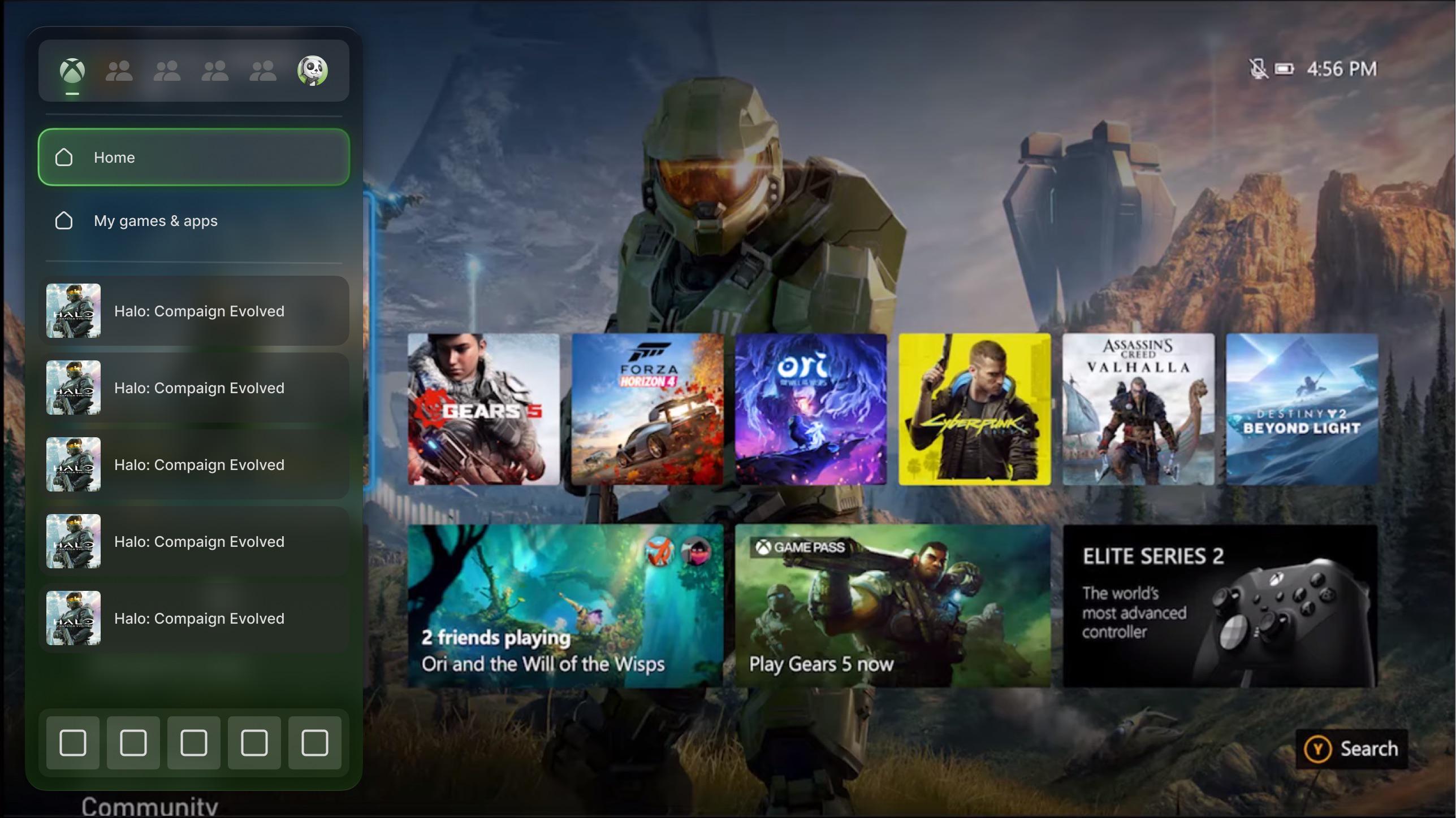
Based on the new logo using a glassy style I attempted to recreate the menu. I do not have all the icons so there are some placeholders and the background is also a placeholder.
Posted by Few-Employ9640
Based on the new logo using a glassy style I attempted to recreate the menu. I do not have all the icons so there are some placeholders and the background is also a placeholder.
Posted by Few-Employ9640
28 Comments
I think the new logo suits the cloud gaming preview dashboard, and this appears to be the next-generation Xbox ecosystem interface across both PC and console.
Looks nice 👍
I’d love a translucent acrylic guide
amazing job
I still really liked the 360 horizontal dashboard. to this day, I never seen any other UI like that.
I’m just very fatigued with this copy and pasted square tile that everyone uses for everything. bring back style.
Is this based off the Xbox One Dashboard before the series consoles released?
I dig it!
I wonder if Xbox One’s dash will keep getting updated by the time they refresh things again because right now yeah my One S still has the latest dash and updates every time I go back to it from my PC lol.
Sir, I can tell you have not wasted time working for Netflix or Hulu but your experience working with touchscreen devices is showing. We do not need to see what is behind there, we can just close the guide. 10 for being on theme, 5 on practicality, 3 on aesthetic. Good work.
Would be nice if Microsoft products were designed to actually have the look they think they have. Marketing has this kind of acrylic look but it’s never consistent.
Halo: Compaign Evolved
Liquid Glass. Apple started the flat bland trend and is now kicking off the glass/acrylic trend.
I dig it!
I love it
Sucker for that liquid glass aesthetic
Can we not make everything use that fucking glass effect again from Vista please.
What would it look like with the OG Xbox background?
Love this
I think he likes halo CE
How did you get the glassy see thru look? Is it on Xbox?
Needs more ads to look authentic
So it’s liquid glass now?
I mean they’ve kinda started smth new with the gradient that the menu now has. If it was translucent that’d be cool.
This but you can change the color of the menu.
Frosted glass supremacy is real
Halo compaign
I can’t wait to play halo campaign evolved and halo campaign evolved and halo campaign evolved.
Jokes aside this is awesome
Hell yeah. The guide is in the need of a good overhaul. Let us customise the layout of stuff too, like remove tabs or entries we don’t need.
Actually looks really good